목차
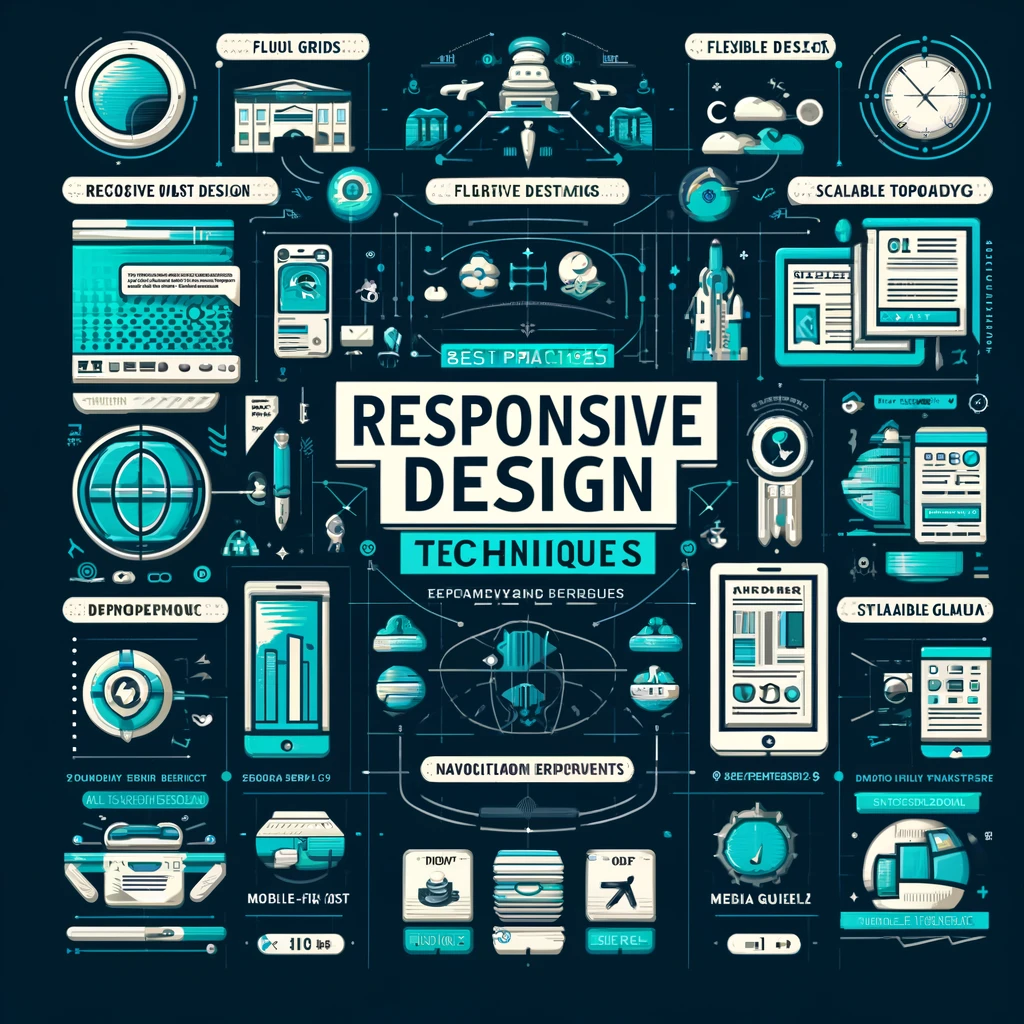
Responsive Web Design Techniques – Best Practices and Strategies
Responsive Web Design (RWD) is a crucial aspect of modern web development. With the proliferation of mobile devices, it’s essential that websites can adapt to a variety of screen sizes and resolutions. This comprehensive guide explores the best practices and strategies for designing websites that provide an optimal viewing experience across desktops, tablets, and smartphones.

Understanding Responsive Web Design
Responsive web design is the approach that suggests design and development should respond to the user’s behavior and environment based on screen size, platform, and orientation. The practice consists of a mix of flexible grids and layouts, images, and an intelligent use of CSS media queries.
Core Principles of Responsive Web Design
Fluid Grids: A fluid grid layout uses relative sizing to fit the content to the device’s screen size. The layout of the site is created using percentages rather than fixed units like pixels.
Flexible Images: Images that scale within their containing elements are crucial to responsive design. This is typically achieved by setting the max-width of the image to 100% of the parent element.
Media Queries: CSS media queries allow you to apply different styles based on the characteristics of the device the website is being viewed on, primarily the width of the browser.
Responsive Design Strategies
Strategy 1: Mobile First
Start designing for the smallest screen size that your website will be viewed on. This helps in prioritizing content and functionality that is crucial for mobile users. Once the mobile design is in place, you can use media queries to add more features that enhance the experience on tablets and desktops.
Strategy 2: Layout and Flexibility
Use CSS Flexbox and Grid: These CSS modules offer more efficient ways to lay out, align, and distribute space among items in a container, even when their size is unknown or dynamic.
Breakpoints: Establish breakpoints in your CSS where the website’s layout will change in response to different screen sizes. Common breakpoints include 480px, 768px, 992px, and 1200px.
Strategy 3: Typography and Readability
Scalable Typography: Use relative units like ems or rems for font sizes so that text scales proportionally across devices.
Readable Font Sizes: Ensure that text remains legible across all devices. A minimum font size of 16px is often recommended for mobile screens.
Strategy 4: Navigation
Consolidated Menus: For smaller screens, use collapsible menus, often styled as a hamburger menu, to save space.
Touchable Elements: Increase the size of buttons and links to create a comfortable touch experience on smaller screens.
Strategy 5: Images and Icons
Vector Graphics: Use SVGs for icons and graphical elements as they maintain high quality at any screen resolution and size.
Art Direction: Use different image assets for different screen sizes where necessary to ensure images do not lose their visual impact.
Strategy 6: Testing and Optimization
Responsive Testing Tools: Utilize tools like Chrome Developer Tools to test how your website adapts to different screen sizes.
Performance Optimization: Optimize images, minify CSS and JavaScript, and leverage caching to ensure that the website loads quickly on all devices.
Best Practices for Responsive Web Design
Avoid Fixed Position Elements: Fixed position elements can create problems on mobile screens. Use sticky positioning if needed.
Prioritize Touch Interactions: Make sure that all interactive elements are easy to tap.
Use ARIA (Accessible Rich Internet Applications) roles and attributes to enhance accessibility.
Continuously Update: Responsive design is not a one-time task. Update your designs and code as new devices and technologies emerge.
Conclusion
Responsive web design is not just about making a website viewable on any device but about ensuring a seamless and engaging user experience. By following the outlined strategies and best practices, developers and designers can create responsive websites that are not only visually appealing but are also efficient and user-friendly. As technology and user expectations continue to evolve, the importance of responsive design will only increase, making it an essential skill for any web developer.
Go Blog Home
